


What is color psychology in home interior?
Color is a silent language that shapes our thoughts, emotions, and decisions. Red sparks passion, green brings balance, and soft neutrals calm the mind. However more than decoration, color influences mood, behavior, and how we experience spaces, whether in branding, therapy, fashion, or home design, quietly guiding how we feel every day.
Why is color psychology important in interior design?
Color psychology explores how colors influence human behavior, turning walls into emotional storytellers soft blues bring calm, warm yellows spark joy, and each color can make spaces feel larger, cozier, or more energetic. However using color wisely creates a home that reflects your personality and supports your emotional well-being.
How does color psychology affect human behavior?
1. Emotional Impact: Colors can instantly trigger emotional responses. Warm tones may evoke feelings of happiness or urgency, while cool tones can bring calm or sadness, influencing our mood without us realizing it.
2. Mental Health: Certain colors can help reduce stress, anxiety, or mental fatigue; calming shades are often used in therapy rooms and hospitals to support emotional well-being.
3. Productivity and Focus: The right color environment can improve concentration and mental clarity; for example, some shades boost creativity while others help maintain attention in workspaces or study areas.
4. Sleep and Rest: Bedroom colors play a major role in sleep quality; soft, muted tones can relax the mind and signal the body that it’s time to wind down.
The science of colors in interior designing–
The science of colors is rooted in how light reflects off surfaces and how our eyes perceive those reflections. Our brains respond emotionally to these colors, making them silent influencers of mood and behavior. Designers use this knowledge to create spaces that are not just beautiful, but emotionally supportive.
Lighting Changes Color Perception
The type and intensity of lighting (natural, warm, cool, artificial) can dramatically change how we perceive color. A soft yellow wall might look cheerful in sunlight but dull under cold fluorescent lighting. Designers carefully consider lighting to ensure color tones stay true to their emotional intent.
Color Temperature Affects Spatial Perception
Warm colors (red, orange, yellow) tend to advance toward the viewer, making spaces feel cozier. Cool colors (blue, green, purple) recede, creating the illusion of more space and openness. This concept helps designers manipulate a room’s perceived size & intimacy without changing its physical structure.
Color Harmony Influences Emotional Balance
Using the color wheel, designers create harmony through techniques like Complementary colors (opposites, e.g., blue & orange) for contrast and energy. Analogous colors (next to each other, e.g., blue & green) for calm and unity. Monochromatic schemes (one hue, different tones) for minimalism and depth.
The Psychological Impact Of Different Colors–
Blue
Blue is a color that evokes calm, peace, and emotional security. It relaxes the mind, lowers stress, and aids focus, moreover making it ideal for bedrooms, meditation areas, or offices. From soft sky blue to deep navy, it brings trust, stability, and a peaceful charm.
Yellow
Yellow is a burst of sunshine; it adds cheerfulness, energy, and warmth to your surroundings. It’s known to spark joy, increase mental alertness, and boost creativity. Yellow is perfect for kitchens, study rooms, or any place.
Orange
Orange is full of life, enthusiasm, and vibrancy. It creates a fun and lively atmosphere, encouraging conversation, social connection, and activity. Moreover, great for dining areas, playrooms, or creative spaces, orange brings a feeling of friendliness and warmth.
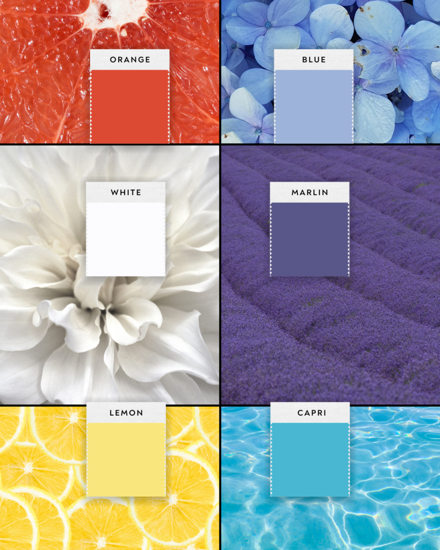
White
White represents simplicity, clarity, and freshness. It opens up spaces, making them feel larger, brighter, and more peaceful. Moreover, white promotes a sense of cleanliness and calm, making it great for modern homes or minimalist interiors.
Which color will be perfect for which area of the house according to color psychology?
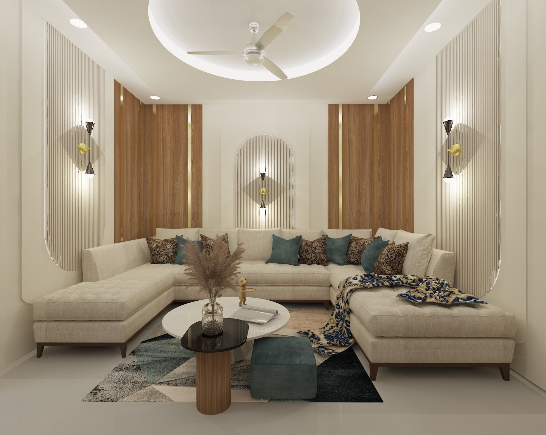
Living Room
For the living room, use warm tones like soft reds, oranges, and yellows to create an inviting and energetic atmosphere. These colors encourage conversation and socializing, making them perfect for a space where you entertain guests. Moreover, you can balance them with neutral colors like beige or light gray for a cozy, yet modern vibe.

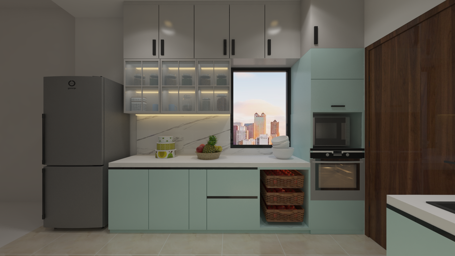
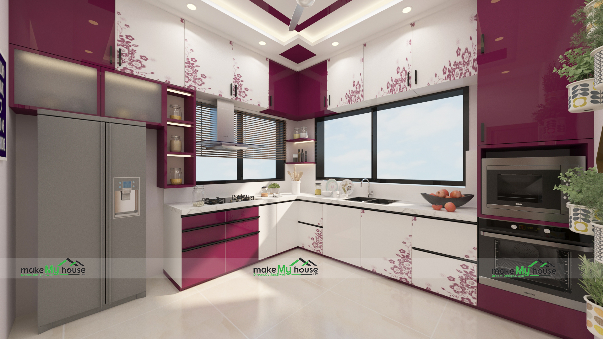
Kitchen
In the kitchen, bright and energetic colors like yellow, red, or orange can stimulate appetite and creativity. These colors promote warmth and energy, making cooking feel lively and fun. Moreover, for a fresh and balanced feel, you can add touches of green, which symbolize health and freshness, especially in areas where you store food.
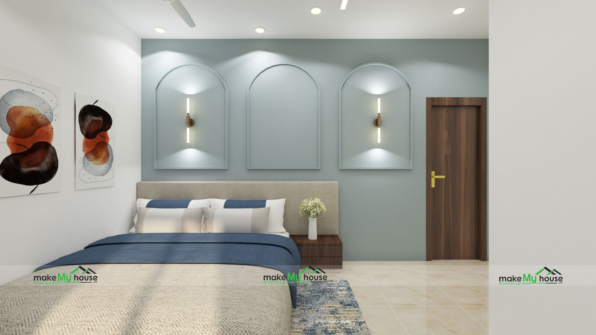
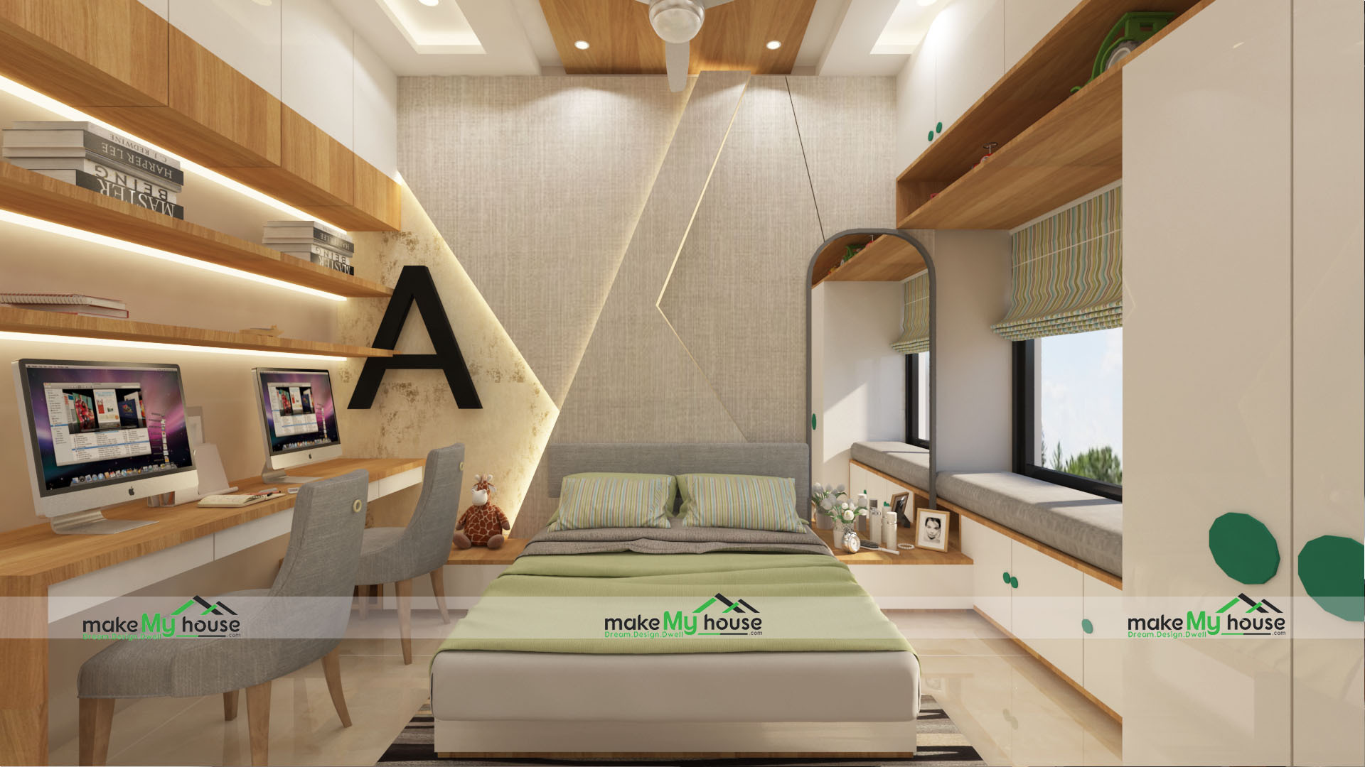
Bedroom
For the bedroom, choose calming and restful colors, for example, soft blues, greens, and muted purples to create a serene, peaceful space. Also, these shades promote relaxation and sleep, making them ideal for creating a tranquil retreat. Light neutrals like beige or off-white also work well to keep the room feeling fresh and airy.
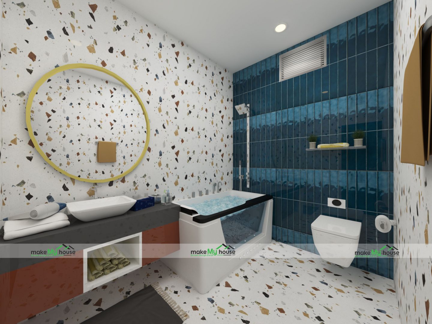
Bathroom
For the bathroom, light, calming colors like soft blues, whites, and light greens work best to create a spa-like, refreshing atmosphere. However colors promote relaxation and cleanliness, making your bathroom a soothing place to unwind. Consider adding soft accents of lavender for a calming touch.
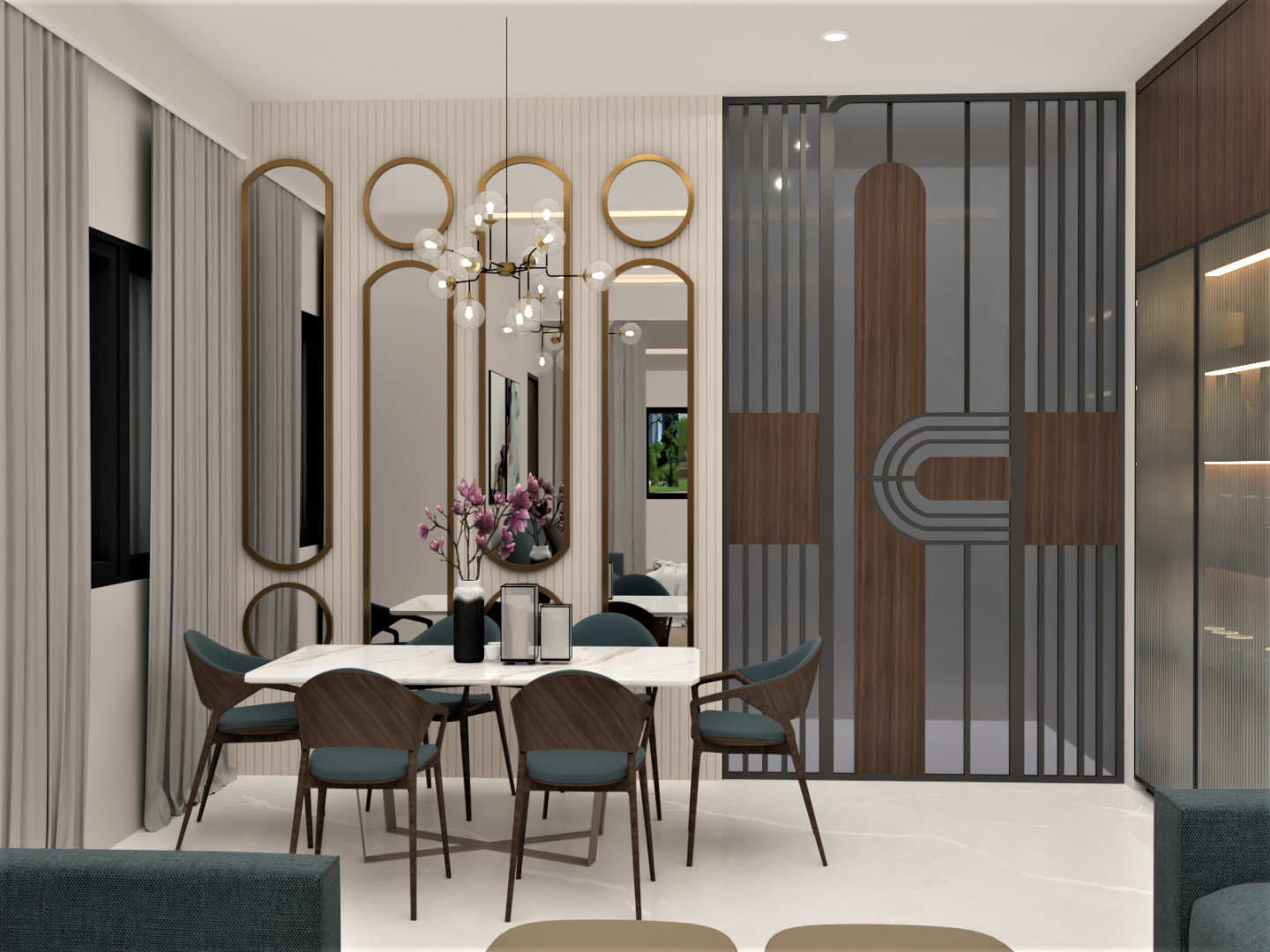
Dining Room
Moreover, in the dining room, use warm, stimulating colors like red, orange, or golden yellow to encourage appetite and social interaction. However, these colors can set an energizing tone for meals and conversations. Pairing them with earthy neutrals or wood accents can create a warm and inviting ambiance.
Study Room
For a study room, blue and green are perfect choices as they enhance focus, calmness, and mental clarity. Moreover, blue promotes concentration, while green creates a balanced, stress-free environment. However, keep the walls neutral with light grays or beige to maintain a peaceful, distraction-free atmosphere.
Conclusion
In conclusion, color psychology plays a key role in interior design by shaping emotions and behaviors. The right colors enhance mood and function. However, calming blues for bedrooms, energizing yellows for kitchens. Moreover, understanding their impact helps create spaces that reflect personality and support well-being.


